
Group runs to compare them
PassgroupName / group_name to evaluate(). Every run with the same group name lands together on the evaluations page.
- TypeScript
- Python
capitals group whether you’re swapping models, prompts, or datasets. Changing the group name means Laminar can’t chart the runs together.
Read the progression chart
The evaluations page lists every group in a sidebar, with a run count and the time of the latest run. Select a group and the right side shows its progression chart and run list, newest first.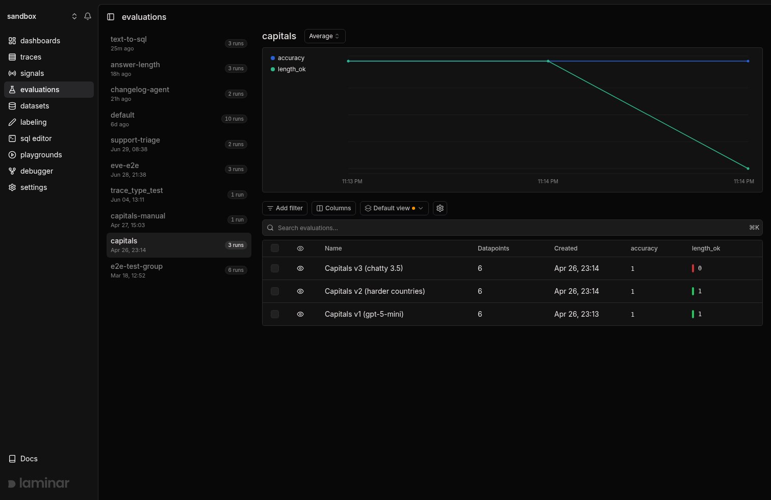
- Aggregation dropdown next to the group name. Average by default; switch to Sum, Min, Max, Median, p90, p95, or p99. Percentiles are the right choice when a few catastrophic rows hide behind a healthy average.
- Legend toggles. Click a score name in the chart legend to hide or show that line. Useful when one dimension’s scale dwarfs another’s.
- Eye icons on run rows. Click the eye to exclude a run from the chart, for example a half-finished run or a known-bad experiment that distorts the y-axis.
length_ok fell from 1.0 to 0.0 on the most recent run because the prompt was changed to ask for a one-sentence fun fact instead of a one-word answer. Every output now exceeds the 50-character limit the evaluator checks for.
Side-by-side comparison
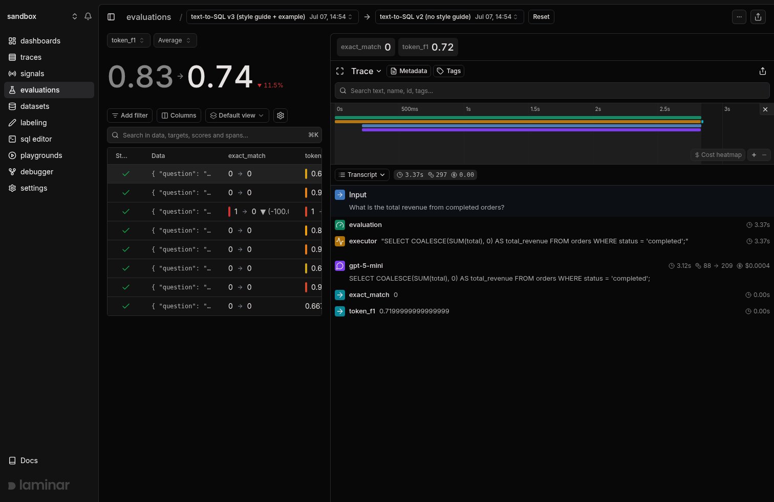
Click any run to open its detail page, then use the Select compared evaluation dropdown in the header to pick a baseline run from the same group. The comparison is in the URL (?targetId=<evaluation-id>), so you can share the link. Hit Reset to drop the baseline.
With a baseline selected:
- The score card shows
old → newwith a colored delta badge, for example0.83 → 0.74with▼ 11.5%. Switch the score dropdown to see the delta for each dimension. - Every row in the datapoint table shows its own
old → newdelta per score column, so you can see exactly which datapoints moved.
See why a score moved with a render template
Per-row deltas point at the regressed datapoints, but the answer to “what actually changed” is buried in the executor’s output. For evals where the output is comparable to the target (SQL generation, structured extraction, translation), a trace render template turns the trace panel into a purpose-built diff view. The example below is a text-to-SQL eval. The template pulls the question from the executor’s input, the generated SQL from its output, and the target SQL from the evaluator’s input, then renders a word-level diff: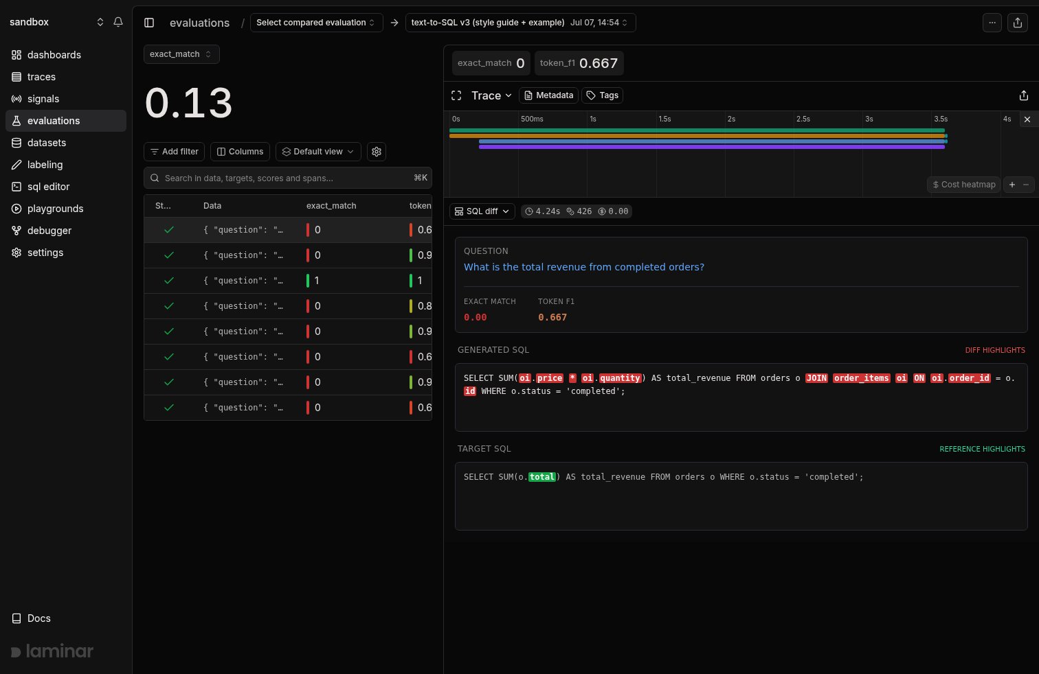
token_f1 dropped even where the SQL was semantically fine.
To build one, open any datapoint’s trace, click the view dropdown (where Transcript and Tree live), pick + New template, and describe the view: Laminar generates both the span filter (here span_type IN ('EXECUTOR', 'EVALUATOR')) and the JSX from the trace’s real spans. Once created, the template appears in the same dropdown for every trace in the project, and the pane remembers your pick, so clicking through datapoints keeps the diff view open.
The full walkthrough, template source, and span payload shape are on the Custom rendering page.
Filter by group in the list
The evaluations page groups runs by default. Click a group in the sidebar, or visit/evaluations?groupId=<group-name> directly. The progression chart and run list scope to the selected group.
Export comparisons
Hit Download on the evaluation detail page to export the datapoints, scores, and executor outputs as CSV. Useful for external analysis or for building regression test suites out of the rows that failed. For anything beyond CSV, query the underlying table with SQL:evaluation_datapoints (one row per datapoint, with scores, target, executor_output, and the joined trace). Each run’s name and group live in a separate Postgres table that the SQL editor does not expose, so filter and group by evaluation_id here and map ids back to runs in the UI. See the SQL editor page for more.
Next steps
Render templates
Build custom trace views like the SQL diff above.
Datasets
Keep the dataset constant across runs so comparisons are apples-to-apples.
SQL editor
Query
evaluation_datapoints for bespoke comparisons and dashboards.SDK reference
Full parameters for
evaluate, LaminarDataset, and EvaluationDataset.